ROLE
Researcher & Designer

TEAM
Me, Myself and I

DURATION
4 Weeks | March 2022

CLIENT
School Project

INDUSTRY
Fashion Retail

TOOLS
Figma | Illustrator

ROLE
Researcher & Designer

TEAM
Me, Myself and I

DURATION
4 Weeks | March 2022

CLIENT
School Project

INDUSTRY
Fashion Retail

TOOLS
Figma | Illustrator

ux case study | march 2022

UNIQLO CANADA APP

Uniqlo is one of the fast-fashion giants. Users have claimed that the app has a bad digital experience such as hard navigation, too much content, and an uneasy checkout process, unlike its web platform. Studies have shown that users spend much more time mobile than on the desktop. (Diara R, 2022) 

Moreover, the COVID-19 pandemic has enhanced online activities such as e-commerce. Retailers like Uniqlo Canada needs to use this opportunity and maximize sales growth by strategically redesigning their app to have a better experience, where users can explore the screens with ease and better checkout process.

ux case study | april 2022

LINK TO PROTOTYPE

App Store Reviews
User Story/Problem Statement

Competitive Analysis
Heuristic Evaluation
User Flow

Wireframing
User Test

High-Fidelity
Design System
Prototype

01 THE PROBLEM

REVIEWS FROM THE APPSTORE ON UNIQLO CANADA APP

PROBLEM SUMMARY:

  •  Poor Navigation – Products are hard to find
  • Too Much Content – There are unrelated and unorganized categories of product information
  • Poor User Interface – Inconsistency, Too small to read or click, and Lack of Hierarchy
  • Better Checkout Conversion – Needs more payment and guest checkout options

user story/problem:

FEATURE: easy to navigate screen

– As a consumer, I want a clean and simplified interface so that I can find products easily

– As a consumer, I want to know the latest deals, promotions, or new season products so that I can shop smart and responsibly.

FEATURE: Purchasing a product

– As a first-time consumer, I want to have uncomplicated checkout so that I checkout faster and with convenience

– As a consumer, I need to have multiple payment methods available so that I can choose the most suitable option for me

DESIGN CHALLENGE

How can we effectively organize content and have easy shopping navigation?

02 THE RESEARCH

COMPETITIVE ANALYSIS

To strengthen the research, I have made a competitive analysis of the top fashion retail apps on how they design and strategize their content organization and checkout process. 

The current app of Uniqlo has both of its strengths and weaknesses. However, major flaws appear to be the overwhelming content of the homescreen, limited payment method options, login options, and no cross-selling opportunity.

COMPETITORS

Uniqlo Canada, Zara, ASOS, Lululemon & Urban Outfitters

HEURISTIC EVALUATION

Furthermore,  I conducted a heuristic evaluation to assess the structure/layout of the app and identify usability issues of the user interface.

For this case study, we are going to focus only on the Men’s Home screen, Product Screen & Checkout Process.

USER FLOW

The objective of this user flow was to understand how users scan information when shopping. 3 major changes were to address:

1. The navigation design, (adding news/articles page for their collections and latest tips, evident shopping opportunities and account)
2. When viewing the shopping cart. What do users see and can interact with
3. Having a Checkout as Guest option

CURRENT USER FLOW
REVISED USER FLOW
(BLUE BOXES ARE THE REVISED CHANGES)

03 THE SOLUTION

WIREFRAME/LOW-FIDELITY DESIGN

I started making my low-fidelity design using Figma with the important elements, using space wisely and making sure it is easy to navigate

HOME

Products are only shown 2 per row to make it more visible

NEWS

 news/articles-related content are moved to another screen to simply the homescreen

PRODUCT CATALOGUE

Well-organized product catalogue

PRODUCT SCREEN

Improving information hierarchy

SHOPPING CART

Intergrating cross-selling that user may want to buy before checkout

LOGIN/SIGN-UP

Adding Checkout as Guest Option

CHECKOUT

Diverse payment options giving customer preferably way to complete the transaction

ORDER SUMMARY

Finalize their orders and information before confirming

USER TEST + FEEDBACK

The test was conducted among peers, and the key insights that needs to improved on were:

Overcrowded Home UI

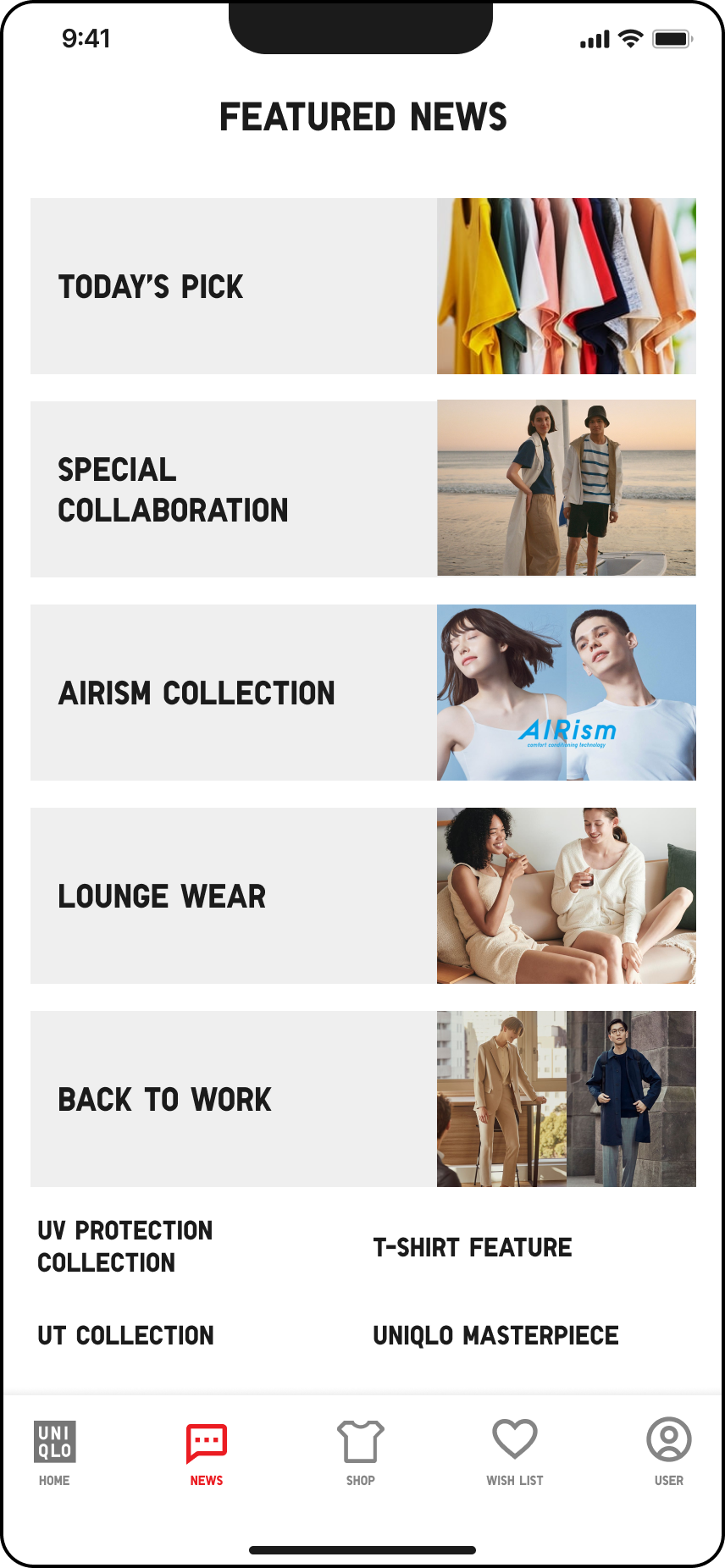
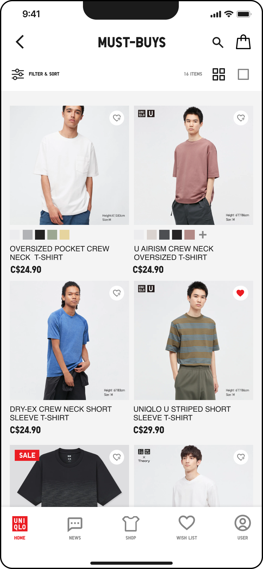
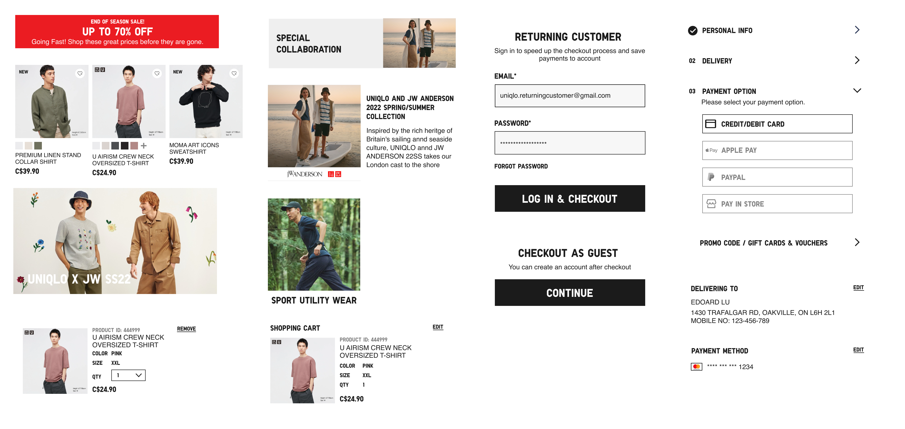
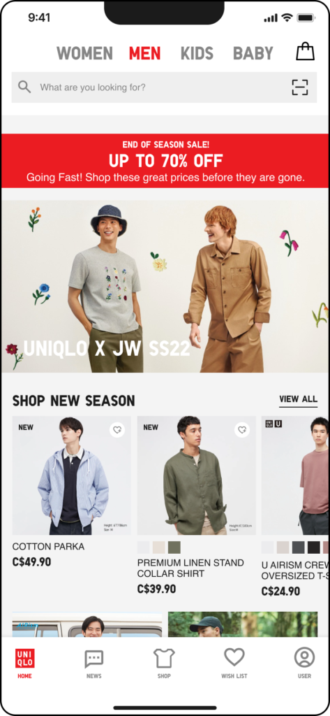
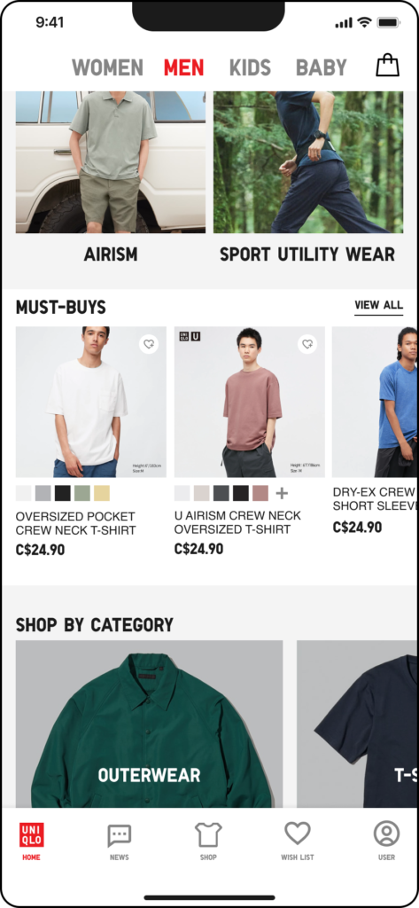
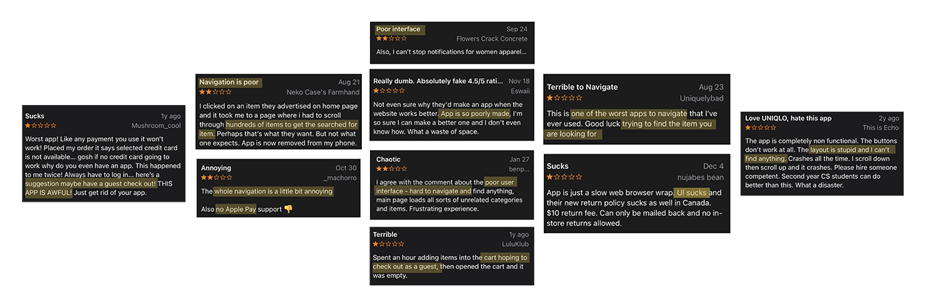
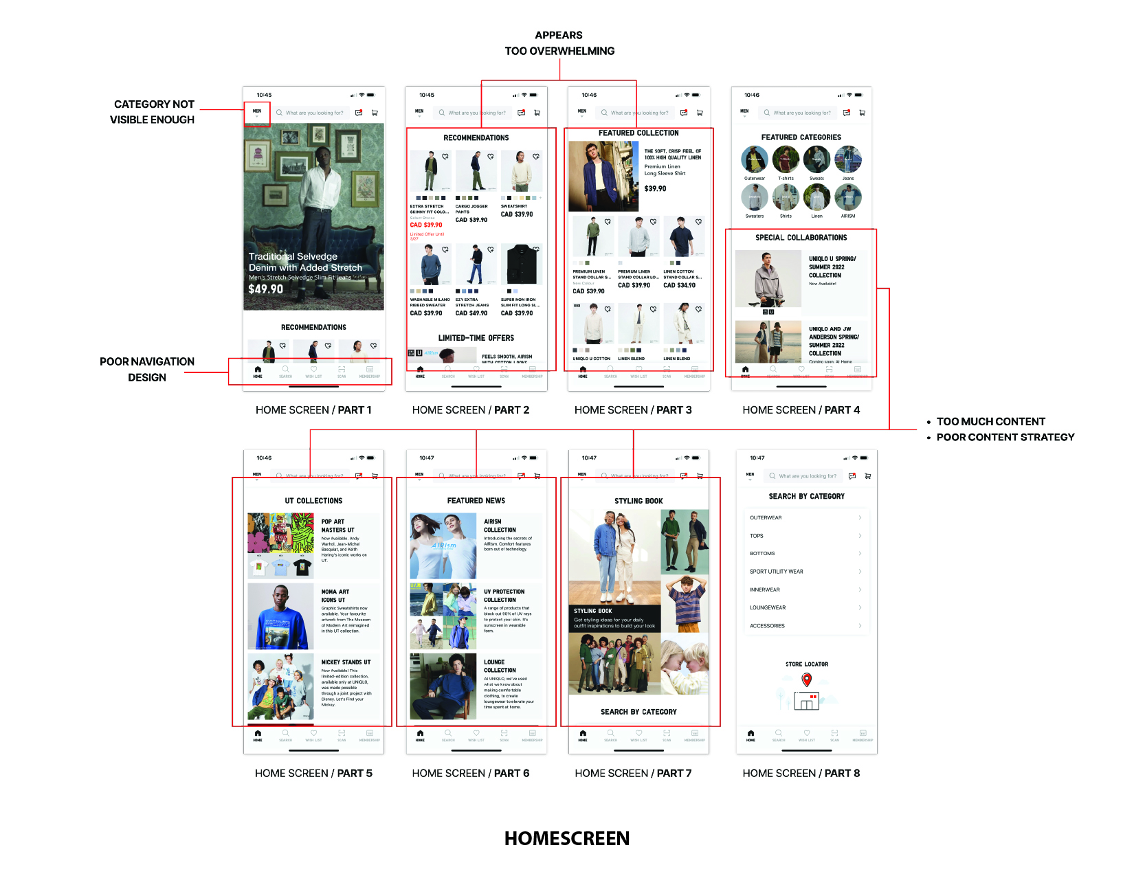
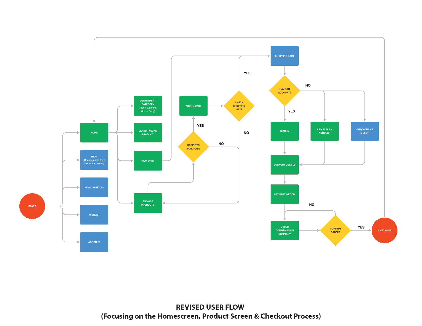
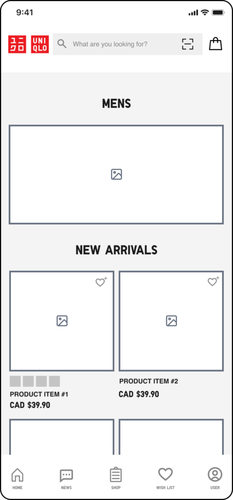
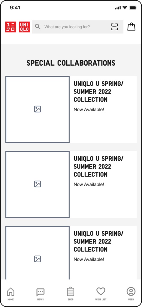
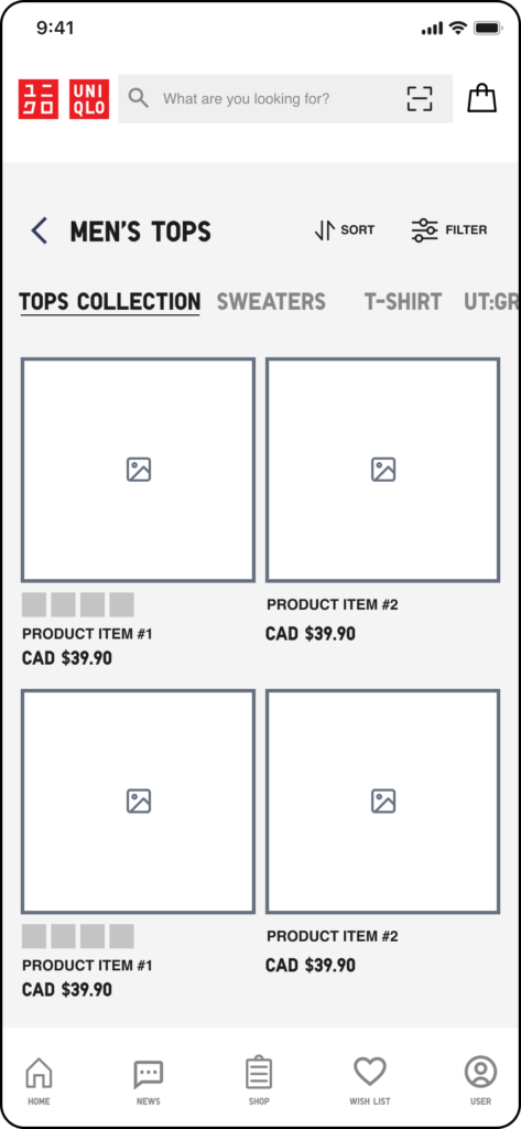
"Can't find collections in the homescreen and too many products displayed for one category"

Inconsistency of Typography

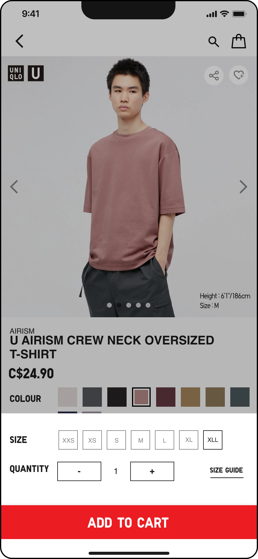
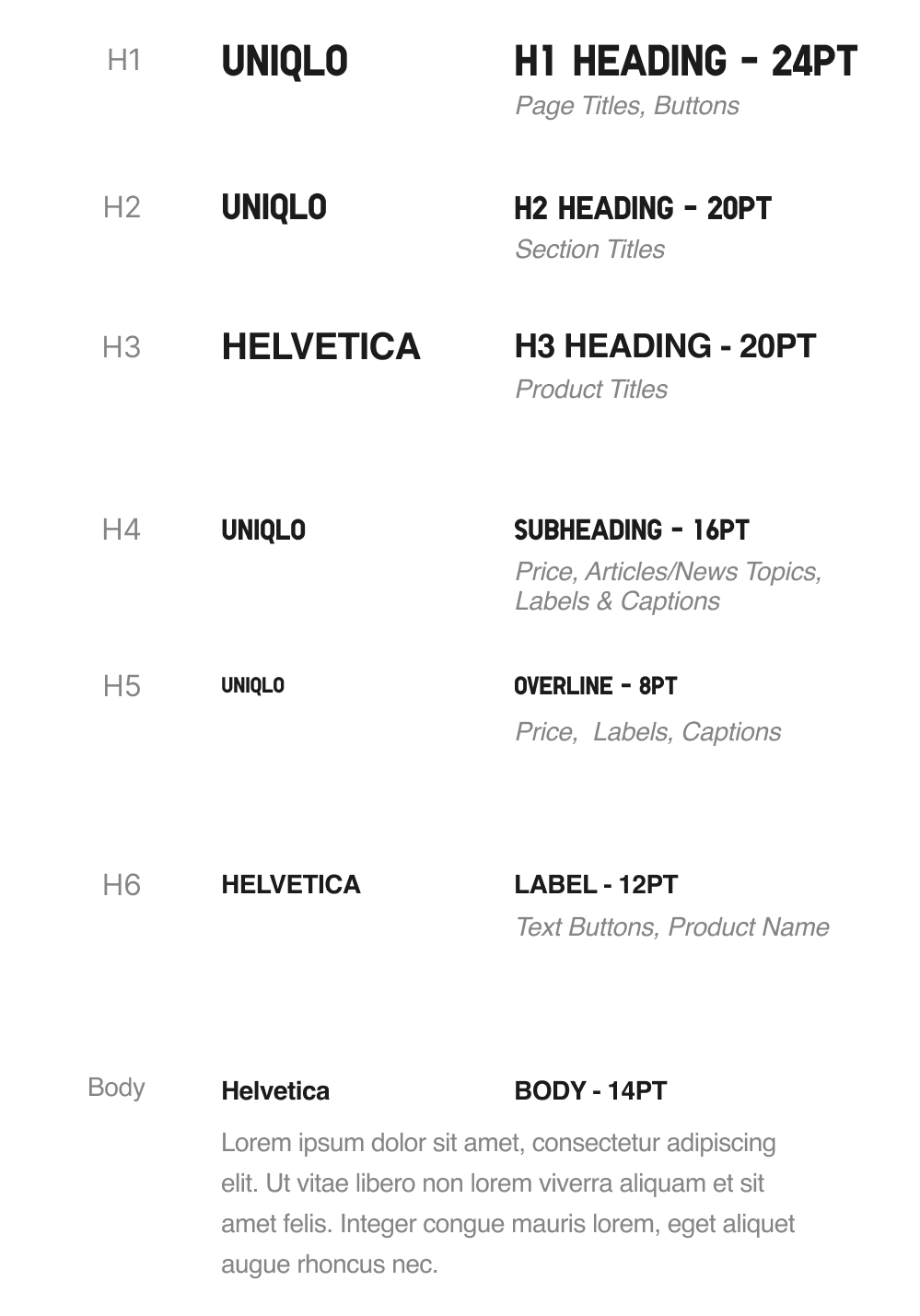
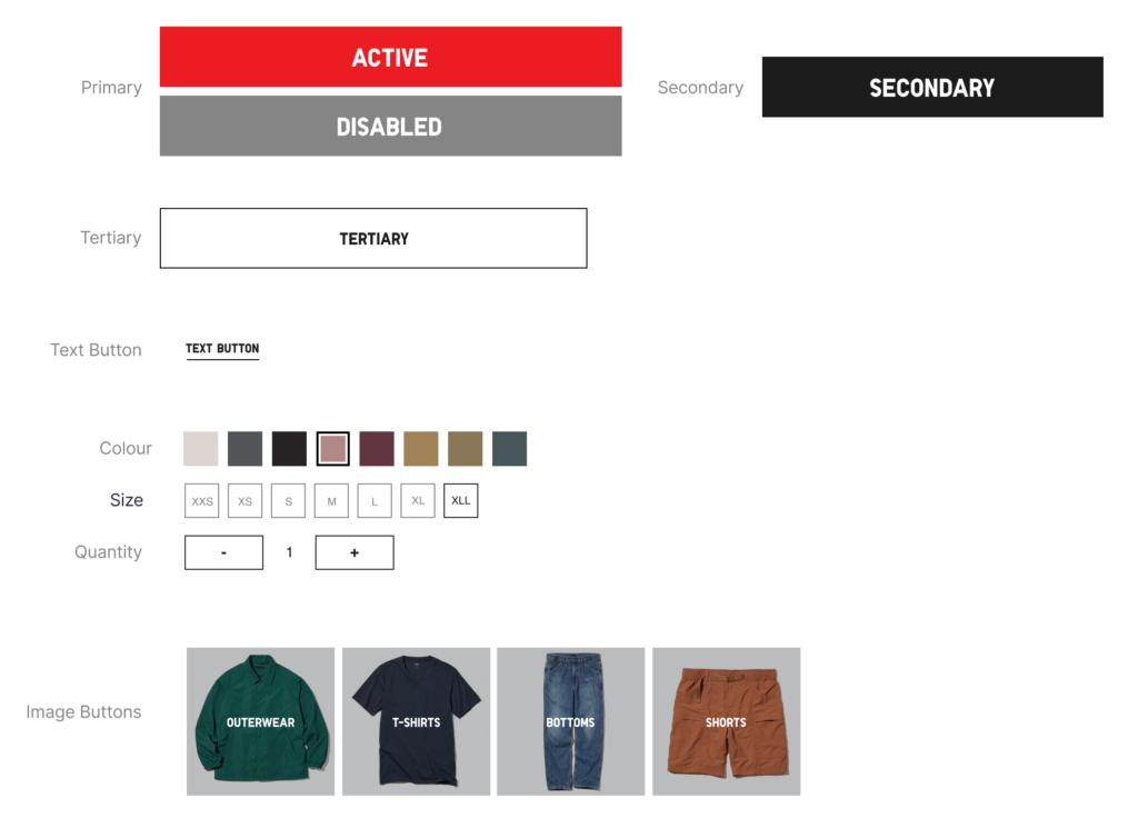
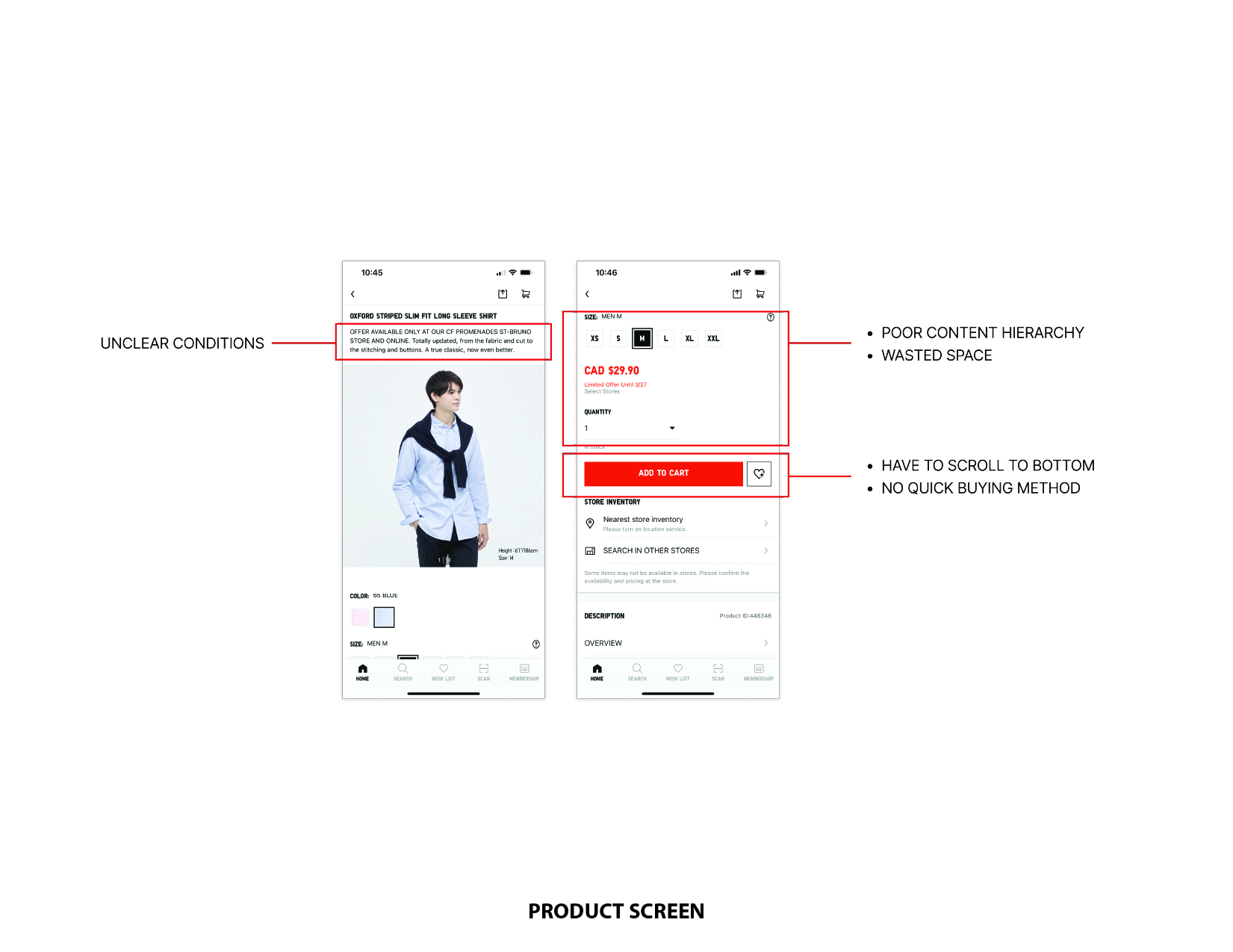
"Some texts appears to be small to read. Buttons were not evident enough."

Inefficient Navigation and White Spacing

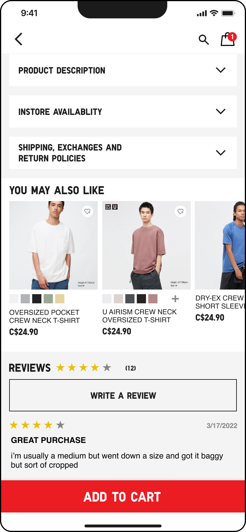
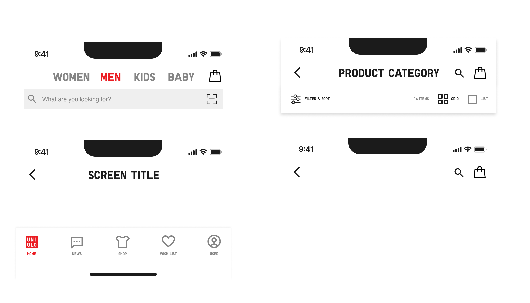
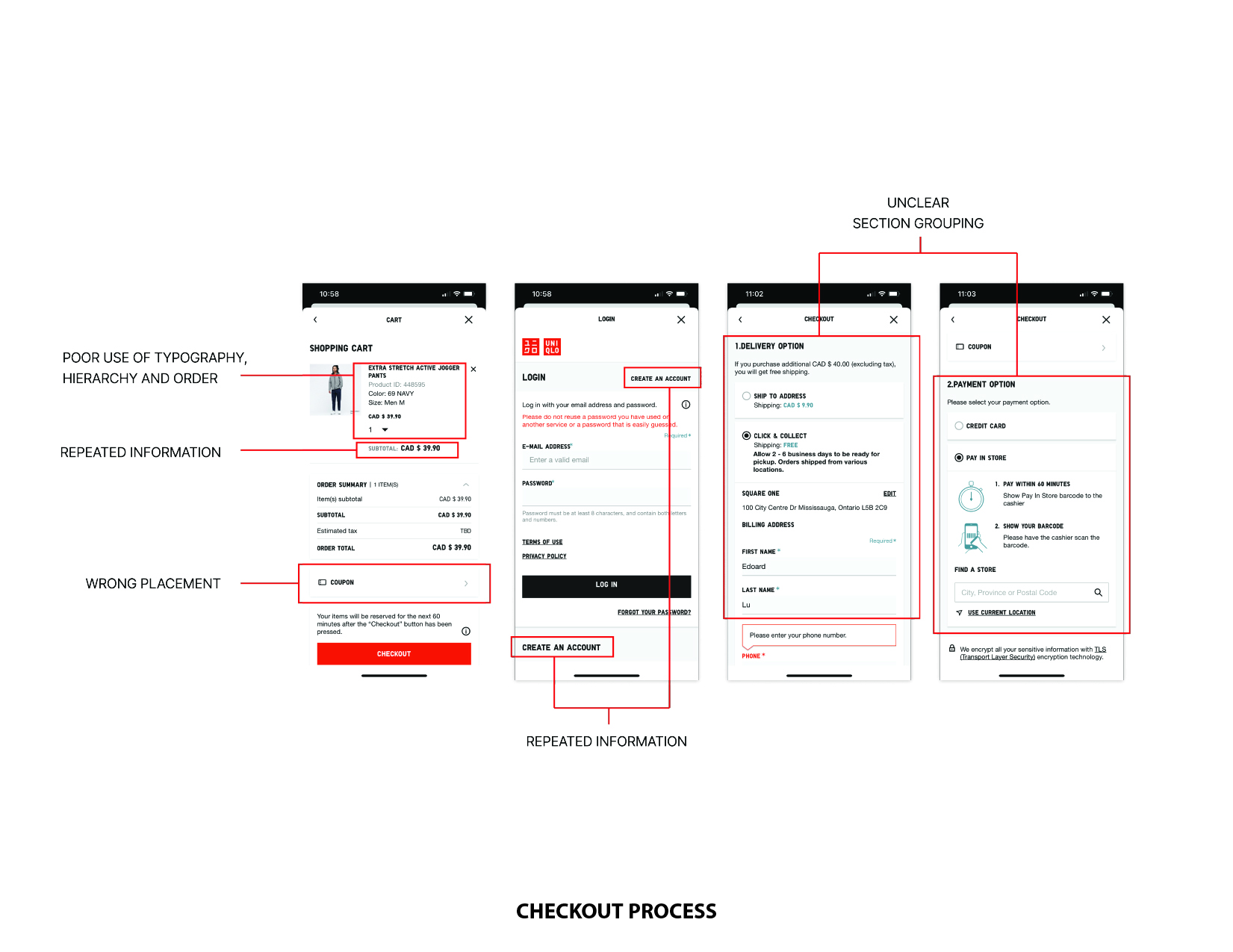
"There seems to be a wasted use of space. Navigation isn't efficient enough. It's taking so much space "

04 THE RESULT (FINAL PRODUCT)

Applying the user test feedback and my own research and evaluation, I have iterated the product design.

HOME SCREEN + NAVIGATION

A clean and simple layout with only the essential categories are shown. Intuitive navigation like the evident Shopping button is visible, as well as account for users who wants to directly register to the app

HOME 1ST-HALF
HOME 2ND-HALF
TOPICS
NEWS

NEWS / ARTICLE

Adding News increases community engagement and awareness of the latest releases with Uniqlo

PRODUCT PAGE

Obvious filter & sort, option to view as 1 or 2 products per row, adding to wishlist label, as well as clear visual hierarchy will get the information user need. 

The fixed bottom with add-to-cart button allows users to focus each tasks, and will still be visible when scrolling back and forth in the product page

PRODUCT CATALOGUE
PRODUCT 1ST-HALF
PRODUCT 2ND-HALF
ADDING PRODUCT TO CART
SHOPPING CART

SHOPPING CART

Integrating cross-selling opportunity before checkout can boost sales growth.

CHECKOUT

Checkout as guest option was added, more payment options are available for to accelerate the shopping experience.  Checkout process is simple through minimizing steps, and focusing on what’s needed to fill out. 

LOGIN/SIGN-UP
CHECKOUT PROCESS
ORDER SUMMARY
ORDER COMPLETE

DESIGN SYSTEM

COLOR SCHEME
ICONS & LABELS
TEXT STYLES
COMPONENTS
NAVIGATION
BUTTONS

TAKEAWAY

As a one-man team, this project taught me the importance of research on how it can contribute to the project, and knowing the purpose of why it is designed that way. Moreover, empathizing with users’ needs helps the overall efficiency and ease of use of the app, but integrating the business aspects of it.


If I had more time:
– Further explore the boundaries of shopping/purchase opportunities as a user and for the business
– See different perspectives on the visual flow and design like e.g. the arrangement of content
– Test out the product design further to know its effectivity and efficiency

THE PROTOTYPE